
Building a Business KPI Dashboard
Update 2019: Since the time I wrote this article, I launched a new product called Sunrise KPI, which makes it much easier to collect all of your key metrics in one place and have your numbers emailed to you every morning. This article shows some of the pre-cursor thinking that led to that product.
“What gets measured, gets improved.”
Isn’t there a wise saying like that somewhere? Well, it’s true.
But keeping a close eye on your metrics, or KPIs (Key Performance Indicators), doesn’t always come easy. Certainly not if you’re a visual thinker, like I am.
Having come from a design and creative background, it’s always been a struggle to force myself to focus on data. I’m usually much more comfortable operating on gut feel and intuition. Poring over numbers and analyzing trends sometimes feels boring and quite challenging for a visual thinker like me. For too long, I failed to make a habit of looking at my metrics—mostly because I just didn’t want to.
Sure, I got by. I kept tabs one metric: My bank account balance. Needless to say, there’ve been a few periods where “getting by” was questionable.
I realize now, that most of the ups and downs were due to a lack of visibility into what was truly happening in my business—The trends in the data that actually impacted that cash balance, it’s fluctuations, it’s flush months, it’s tight months.
This lack of visibility led me to work on the wrong things at the wrong time. Sometimes I’d mistake the level of urgency of a task (“my website needs a redesign right now!”). Other times I’d fail to see opportunities sitting right in front of me (like the fact that we’ve had a stellar close rate and just needed more leads, not a better product).
If you’re not making a habit of watching your key performance indicators (KPIs), you’re running blind. I know this now.
Still. Making a habit of “being data-driven” is another story.
Today I’ll show you how I—a non-data-nerd creative designer who once barely knew how to operate a spreadsheet—learned to become more data-driven and actually like it! I’ll show you how I built the MVP of my first KPI dashboard with just the bare essentials. Then, how I upgraded to a fully automated and more complete KPI dashboard that drives all of my “work-on-the-business” decisions today.
And of course, how you can build the same thing for your business.
Where’s the data?!
If your business is anything like mine, the data you need is everywhere and nowhere.
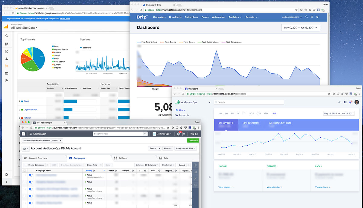
Your business bank account; Your payment processor; Your site analytics; Your email marketing software; Your lead forms; Your social media profiles; Your ad campaigns.
Every one of these (and probably a few more) live in their own silos. Every account has a different reporting capability, each with different metrics that matter in different ways.
For example, you can log into Google Analytics and see your traffic is up. Great! But if you don’t log into your email marketing tool to see how many converted to subscribers, and how many of those opened your emails, you can’t easily see whether or not you’re attracting the right quality of traffic. And without knowing this, you can’t make smart decisions about how you’re driving traffic to your site.
As I said, I wasn’t disciplined enough to make a routine of tracking and analyzing my data. I’d glance at various metrics sporadically, only when I happened to be in a particular tool.
In my last business, I came up with a simple solution: Have my assistant collect all of the key metrics from my various apps, manually input them into a spreadsheet, then send me an email every Friday with a link to view that sheet.
This didn’t require complex programming to setup—beyond writing out the procedures for my assistant to follow when collecting the data points I wanted. And it forced me to look at the data, all in one place, on a weekly basis, because it landed in my inbox every Friday.
Plus, by delegating the task of digging up the numbers and updating the spreadsheet, I removed the boring/tedious part of the process (which historically led me to ignore my data altogether), so I can focus on just the meaningful (and enjoyable) part: Reviewing the numbers. Connecting the dots. Thinking it over. Using what I learned to plan next steps.
Too much data!
The next challenge to overcome on your quest to becoming a data-driven business owner is dealing with data overload!
Every tool lets you slice and dice and dig deeper and deeper into the data. Not only can you see site traffic, but you can also see how many came from search engines, how many are on mobile devices, how many visited before, how much time they spent, which version of which links they clicked, what time of day they converted, what season was it… ahhh!!
Just because you have access to every metric imaginable, doesn’t mean they’re all helpful.
You have to decide which are your key metrics and which are optimization metrics.
Key metrics enable you to make big-picture decisions about your business, so these need to be included in your KPI Dashboard. Key metrics look backwards to clarify “what happened” and “why”. Key metrics help you move forward and decide where you need to focus your time and resources next.
Optimization metrics are useful when you’re digging into a particular piece of your business and making a project out of optimizing that piece. Pay-per-click ad campaigns, and all the metrics associated with these are a good example. If you’re focused on improving PPC performance this month, then go ahead and get your hands on all the numbers you need. Slice and dice to your heart’s content. Just don’t let these optimization metrics add noise to your big-picture, longer-term decision-making process. Keep them off your KPI Dashboard.
Which metrics matter (and when)?
I found it’s helpful to know which phase your business is in: “Startup” mode or “Growth” mode? The metrics that matter will differ in each phase.
“Startup” KPIs
I know companies may call themselves “Startups” for several years. Semantics. What I’m referring to here are your very early days, when you’re hacking and clawing for your first batch of customers, just to get your business to a point where it’s sustainable-enough to keep going.
During this early phase, it’s very easy to go overboard and waste a bunch of time and resources on KPI tracking. If you’re trying to wrangle too many KPIs into a fancy dashboard with pretty graphs, custom-programmed data reporting, automation and all the rest, you’re just spinning your wheels. The numbers aren’t significant enough yet to make actionable business decisions on. In fact, they’ll probably mislead you.
So like everything else in the early startup days, go MVP (minimum viable product).
For the first 18 months of building my business, Audience Ops, my KPI dashboard consisted of a single Google Spreadsheet, which I updated manually every time a new client signed up or cancelled service. Yup, I literally typed in my customer’s details myself every time.
Was it perfect? No way. Error-prone? You bet. Incomplete? Of course. But it gave me just enough visibility into the only metrics that truly mattered during those early months: How many active customers do we have, and what’s our MRR (monthly recurring revenue)?
Sure, I looked at other things that were going on, like traffic, email list engagement, our early funnel experiments, etc. But my top priority (and only things I could justify spending time on) were talking to customers, refining our product, plugging holes, and starting to build our systems.
“Growth” KPIs
At some point, you’ll find yourself far enough along in your business that you’ll feel hampered by a lack of visibility on all your key metrics.
You’ve got plenty of customers. You had some marketing and product wins. Now you need to make high-level decisions as to which levers to pull and push in order to grow your business in the next quarter, the next year, and beyond. But you struggle to know what those levers are, since you don’t have an easy view into all of your key metrics.
It’s not that you’re unable to go get them and look. It’s that you don’t have the time to spend digging them out of your various apps and pushing aside all of the little optimization metrics that add noise. You need just the key metrics, ready to help you make those big-picture decisions.
This is where a truly complete KPI dashboard will do your business a lot of good.
I found myself in this position around 18 months into building my current business, Audience Ops. Frankly, I procrastinated on upgrading my KPI dashboard until about 24 months in and my business suffered for it.
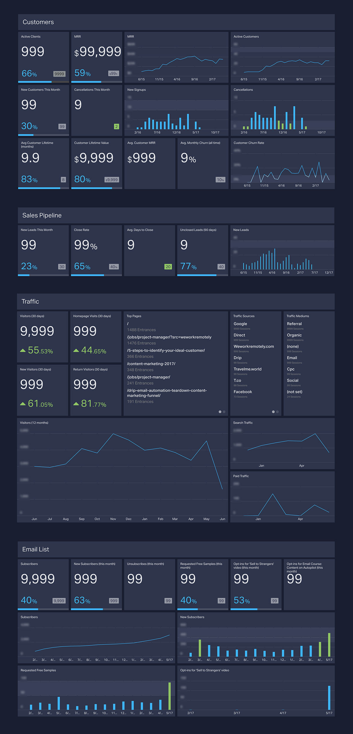
These are the key metrics that matter most to me in my business. I’ve built all of these into my single KPI dashboard, which I’ll show you in a moment. I broke them into four categories:
Customers:
- Number of active customers
- Number of new customer sign ups
- Number of cancellations & customer churn rate
- Monthly recurring revenue (MRR)
- Average MRR per customer
- Average customer lifetime (months)
- Customer lifetime value
Pipeline:
- Number of leads
- Sales close rate
- Avg. number of days to close a lead
- Number of active leads in the past 3 months who haven’t closed
Traffic:
- Overall site traffic
- New visitors
- Return visitors
- Visitors to the homepage (which is our pricing and customer signup page)
- Traffic from search
- Traffic from paid ads
- Top pages viewed
- Top traffic sources
Email list:
- Subscribers
- New subscribers added
- Unsubscribes
- Subscribers who requested free samples
- Subscribers who opted in for our primary lead magnet (webinar)
- Subscribers who opted in for our secondary lead magnet (email course)
My KPI Dashboard
Note: The numbers are obviously placeholders. I didn’t want not to share my real numbers here because A) who knows when you’ll be reading this, so they’re almost certainly no longer accurate and B) my numbers aren’t what’s important. What I’m showing here is how I laid out my KPIs so I can quickly and easily see them, think about them, and act upon them.
Building My Dashboard
As I said, my basic spreadsheet got me through the first year+, but it was far from perfect. So when I set out to upgrade to a more robust KPI dashboard, I had the following goals:
- No more manual entry. It has to update itself in realtime.
- It has to include all of my most important KPIs (and nothing else).
- It has to be easily accessed on mobile. I do at least half of my work from my pocket these days, so I need my numbers with me.
I’m using GeckoBoard for the dashboard itself. I love the customizable visual layout, plus it has solid mobile app.
Although GeckoBoard has a large library of integrations with most of the popular apps, I found that most of these “out of the box” data points were too basic. For example, I can connect my Stripe account and see show the number of active customers I currently have, but I can’t get MRR growth over time, new signups by month, etc.
So I needed a place to gather, calculate, and store the data I need. GeckoBoard can pull in data from a Google Spreadsheet and show it in any number of ways (a number, bar graph, line graph, etc.). I created a couple of Google Spreadsheets, where I’m gathering data, logging history, running calculations, and generating the raw KPI data points.
Now the question is, how do I get all of the data I need from all of my apps (Stripe, Drip, Google Analytics, Gravity Forms, etc.) into my Google Spreadsheets?
Luckily, a close friend of mine is extremely good at getting these apps to talk to each other. His name is Zapier 🙂
Zapier has practically become a powerful programming language in itselt, at least for non-programmers like me. It’s ability to chain API automations together and it’s extremely robust set of options, filters, and vast library of apps you can connect is truly amazing. It’s a necessity for most online businesses, especially a productized service business like mine.
I’ve got 3 main “Zaps” that power my KPI dashboard. Each of these has multiple steps chained together (some have more than 10 steps!):
– New lead (triggered when someone fills out our consultation form, a Gravity Form)
– New customer signup (triggered when a Stripe subscription is created)
– Customer cancelled (triggered when a Stripe subscription is cancelled)
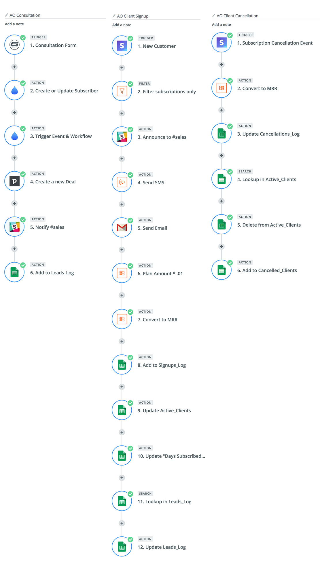
Now, all of this may seem easy enough so far. Connect apps to Zapier, Zap their data in Google Spreadsheets, then view that data in GeckoBoard. But there’s more to it than that… And that “more to it” was what turned this from a 1-day project into a 2-week project.
The tricky part was slicing and dicing the data once it was in my Google Spreadsheets to form it into metrics that I can view in GeckoBoard. Let me explain:
Getting a total customer count: Easy enough.
Calculating total MRR, taking into account monthly, quarterly, & annual subscribers: A little formula work, but not too hard.
Updating active customer records when they cancel: Required some of Googling, trial and error, but I eventually figured it out.
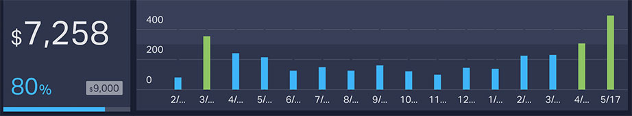
Recording a “snapshot” of the MRR and customer count on a monthly basis, so I can chart growth over time: That’s where I got stuck…
You see, formulas in spreadsheet cells only work in real time. The present. Data exists over here, show it over there. But if you need to automatically store a data point on a recurring schedule—for example every 1st of the month get the current MRR and add it to a list sorted by month—That requires some actual programming. Code. Google Apps Script to be exact, which is JavaScript.
Sure, I’ve hacked apart some jQuery stuff in my day, but writing custom-built JavaScript functions from scratch? That’s above my pay grade. At first, I combed through StackOverflow and Google support forums to see if someone has done this (seemingly simple) task before. Nothing worked.
After 2 days of tearing my hair out on this, I stopped. I wrote out what I needed this simple, magical, script to do, and I posted the job on Upwork. I hired 2 different guys from India, and 24 hours and $30 later, I had the script I needed. I love the Internet.
I spent another few days syncing up my Drip email marketing data to GeckoBoard, again using Zapier and Google Spreadsheets. And a bit more time tweaking the layout of my dashboard until I felt it’s where I need it to be.
Want more of the technical details behind how I connected these tools together?
Goals & Targets
One final note: Once you have your slick KPI Dashboard, what do you do with it (besides stare at the pretty graphs all day)?
Set some goals and metrics targets.
GeckoBoard has a cool feature, which allows you to set a specific “Goal” for any metric shown on your dashboard. For example, you can say “I want to get at least 50 new leads per month” or “the number of cancellations shouldn’t exceed 3 per month”. It will then highlight that number so you can see visually, whether that goal has been met, or what percentage of the way there you are.
Now—based on your historic data—you can begin to figure out how much traffic has resulted in how many leads and how many customers that produced. Then you can start making informed projections and targets to aim for going forward.
And with that information, you’re able to back up your decision to focus time and energy where your business truly needs it at any given time.