
Software UX Hacks That Get Users There Faster
Update 2019: This article references a software product called "Ops Calendar". That product has since been changed and renamed to ProcessKit. However, many of these concepts and examples are still relevant today.
Figuring out a new piece of software is always a bottleneck.
In other words: Your users aren’t trying to use your app. They’re trying to get to the result. Save time, make money, finish a job, be entertained, etc.
Start with this truth in mind and your users will thank you (hopefully with their wallets).
Most software gets in the way.
Most first-time users’ satisfaction is delayed. Most tools require tutorials, training, and setup before the user can start being productive. Most software forces you through an “onboarding wizard” or pushes customer success calls.
Onboarding material, docs and helpful support are nice-to-haves, of course. But they’re not replacements for designing truly intuitive software that users can learn and use themselves—Fast.
In other words: Help the user to leapfrog past that frustrating “onboarding” phase and skip right to the “using” phase. Help users figure out (on their own!) how to be productive with this tool as fast as possible.
That’s the guiding philosophy I’ve had when designing all of my software products—Most recently, Ops Calendar.
I made a list of my go-to user experience and user interface hacks when designing a software product.
In my video below, I show you how I put these into practice in my SaaS project, Ops Calendar. But these concepts can be applied no matter what your software helps users do.
My 7 “Go-To” Software UX Tips
In no particular order…
Don’t Dictate Useage
Some tools are so broad that they’re either too simplistic and lack features that power-users will need, or they try to please everyone and become bloated with too many features, options and buttons.
The other end of this spectrum is when a tool tries to “dictate” how users are supposed to apply this tool in their workflow. Often they make too many assumptions about individual users’ use-case.
I find WordPress falls into this trap in some areas. When you invite a user to WordPress, they give you 5 pre-defined “roles” that users could be. They even tell you what these roles are (author, editor, contributor, etc.). What if those roles don’t apply to your situation? What if you need to invite clients? What if you need to invite your compliance team? What about your VA? This doesn’t offer a lot of flexibility. Most users feel like they’re fitting people into boxes that don’t exactly suit their true “role”.
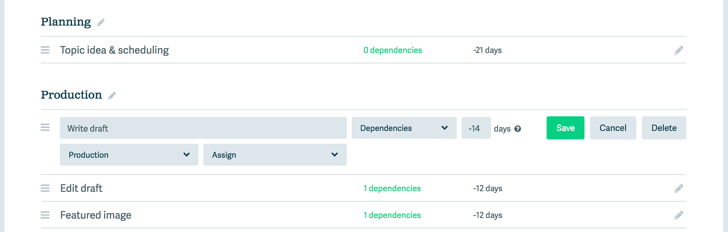
So wherever possible, I try to focus on designing the framework, but let the user decide how to put our framework to use. For example, in Ops Calendar, account owners can create their own “User Types”, then define what each user type can see, can do, and which settings they can configure.
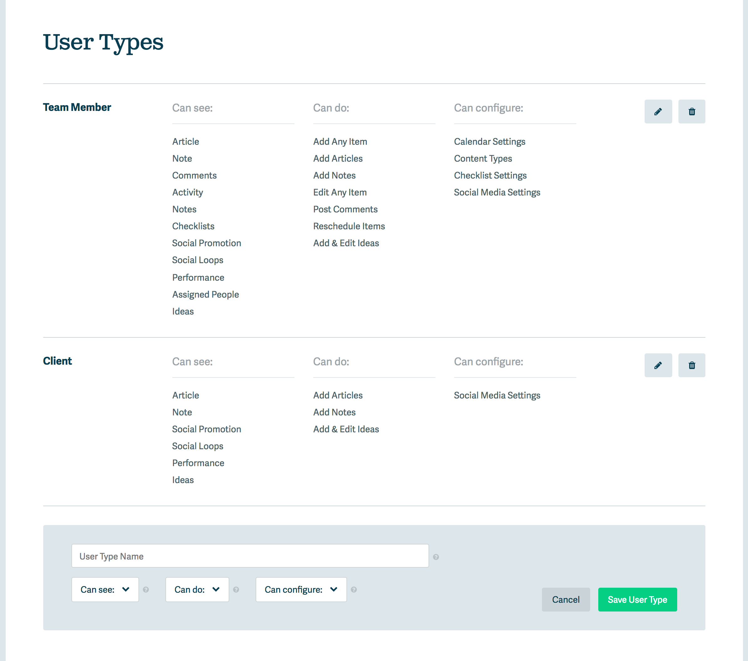
User types interface in Ops Calendar
I follow the same model when it comes to our custom Content Types interface. Instead of dictating and assuming all users will want only “Articles” on their calendar, we provide a way to create items of any “Type”, call them anything (Podcast, Webinar, Video, Whateveryouwant), give them their own icons and components. Users can fit the tool to their personal needs and workflow.
But that sounds like it’ll require a ton of setup work, right? Well that leads me to UX hack #2…
Pre-Created Content
Many tools start you off with some demo content or example project or what have you. These are useless and only get in the way. Users first task is to figure out how they clean that stuff out of their account before they can actually start using the tool how they want.
Or on the other side of this spectrum, many tools start you off with nothing. A blank screen. You can’t start working until you set up some templates, some settings, some whatevers… That’s a slow frustrating startup experience too.
My software, like most, does require a bit of initial set up. But out of the box, we pre-create all of the things you’ll need. This way, you can literally sign up, start adding things to the calendar and start getting real-world (not “pretend demo world”) results from the tool immediately.
Every new account comes with two content types pre-created (“Article” and “Note”), along with our Article Checklist Template and two user types (“Team Member” and “Client”). Since most users use Ops Calendar as a content editorial calendar, these help them get off and running for that use-case immediately.
But if someone’s use case differs a bit, all they have to do edit, duplicate, or delete what we give them. For example, if they run a Podcast instead of Blog Articles, just rename that content type. If they don’t want to invite clients, but instead invite a VA, rename that user type. Quick and easy. Keeping the momentum going.
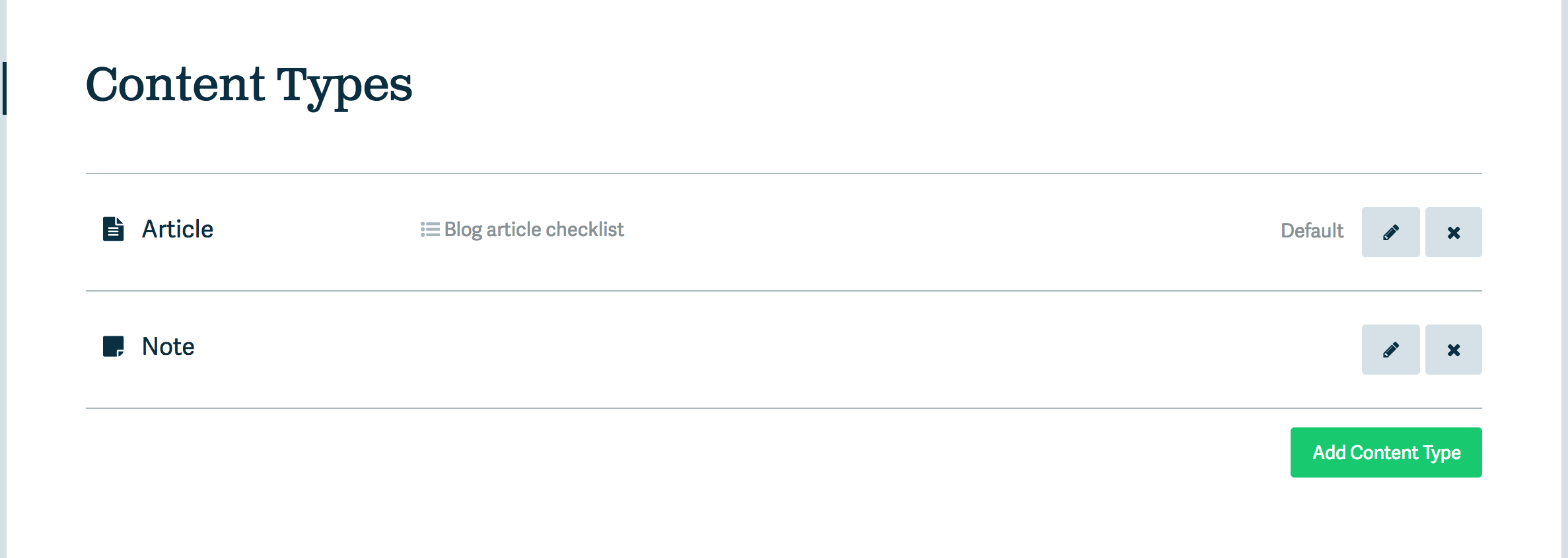
Content Types interface in Ops Calendar
In-Line Tips
Small, unobtrusive help bubbles (a.k.a. tool tips) can go a long way to helping your first-time users figure out your app quickly, without having to go off to a documentation site or read some tutorials.
I like to place help bubbles alongside options and settings, and fill them with well-crafted microcopy that clarifies exactly how and why you’d want to use this particular setting.
It’s a good idea to offer an option to turn help bubbles off, if users don’t need them anymore.
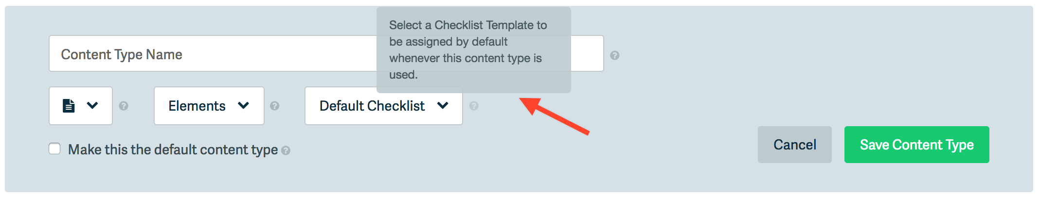
Help Bubbles like this appear throughout Ops Calendar.
Buttons That Do What They Say
Use this tip when designing any sort of website, but it especially applies in software interface design.
Every button in your app should have a descriptive, actionable button label. A verb. Click this button to do something specific.
You’ll find button labels throughout Ops Calendar like “Add Item”, “Save Content Type”, “Duplicate”, “Reconnect”, “Upgrade & Continue Trial”, etc. Anything to help the user instantly know what will happen once they release their finger from their mouse button.
Descriptive button labels in Ops Calendar
Visual Style Guide
This might seem like a “nice to have” but it goes a long way to helping your users instantly orient themselves and navigate through your application, without having to read documentation or squint at small labels.
By keeping a standard color palette, and applying standard, consistent styles to common elements throughout your app, users will feel like they’re experts on their very first session. They can follow familiar visual queues that imply forward motion throughout the app.
A few common components, which I’ve defined standard styles, CSS, markup, and layout for in Ops Calendar include:
- Buttons (primary and secondary)
- Links
- Headers
- Modal popups
- Dropdown menus
- Form fields
- Settings panels
- User avatars
A complex interface that feels simpler thanks to familiar visual queues.
Users Without Photo Avatars
This is a simple one but really goes a long way to making users feel like they have a personalized experience right out of the gate.
It’s always good for users to upload their photo to use as their avatar throughout the app. Or perhaps you offer an option to sign up using Google, Twitter or Facebook, which will grab the photo from there. Great.
But what about those users who don’t take the time to customize their profile photo? Will you do what every other app does and show a boring, blank default placeholder avatar? Nothing makes me want to interact less than seeing the default, blank avatar image.
Instead, why not steal a good idea from Google (that’s where I first saw this one)… For those users who don’t have photos, show the first initial of their first name. This helps other users instantly “see” that person interacting in your app, and encourages more interaction.
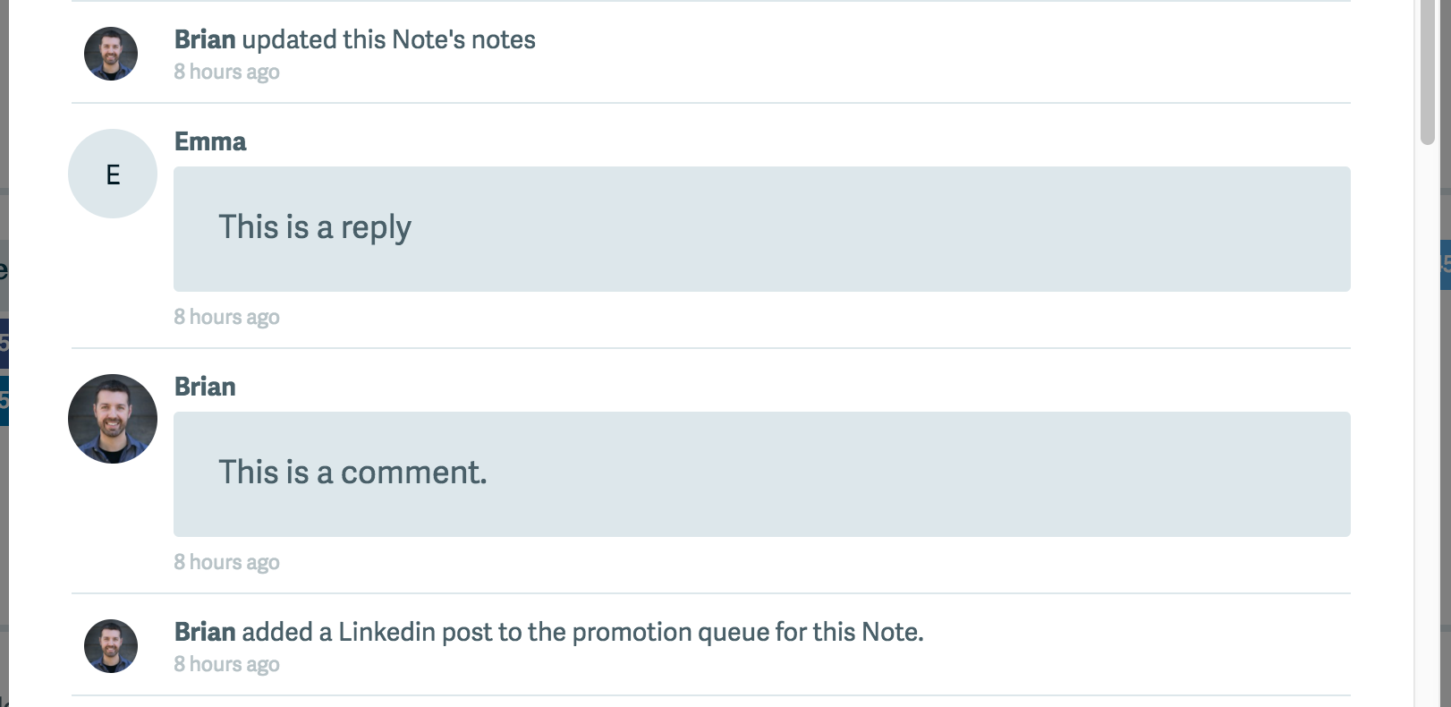
"E" represents Emma on my team in Ops Calendar
Prioritize Key UI Features
The tendency most entrepreneurs have when they’re investing in building version one of their software product is to build a minimal viable product.
I get that. Validating what you build before (or while) you build it is essential. But don’t let this fool you into pushing off all UI and front-end design optimizations until later.
There are some elements that are so core to your user’s experience that they deserve extra love to get them just right. Even if that means spending a bit more time up-front.
In Ops Calendar, one of those key components is our Calendar view (obviously). I heard from users that clicking “next month” and “previous month” to navigate from week-to-week is a clunky, frustrating experience when managing a multi-month content calendar. I experienced this frustration myself.
So our infinitely scrolling calendar view, which enables users to flow from one month into the next as they navigate and plan their content, was my first priority when building the app. This was a difficult and complex front-end UI to build, but the team and I spent our first few weeks working on just that before we dove into the rest of our core features.
The app is better for it and it gives users an instant boost of productivity on the very first screen they see.
So what I’m saying is, yes, front-end UI can be a feature worth investing time on, even in version 1.
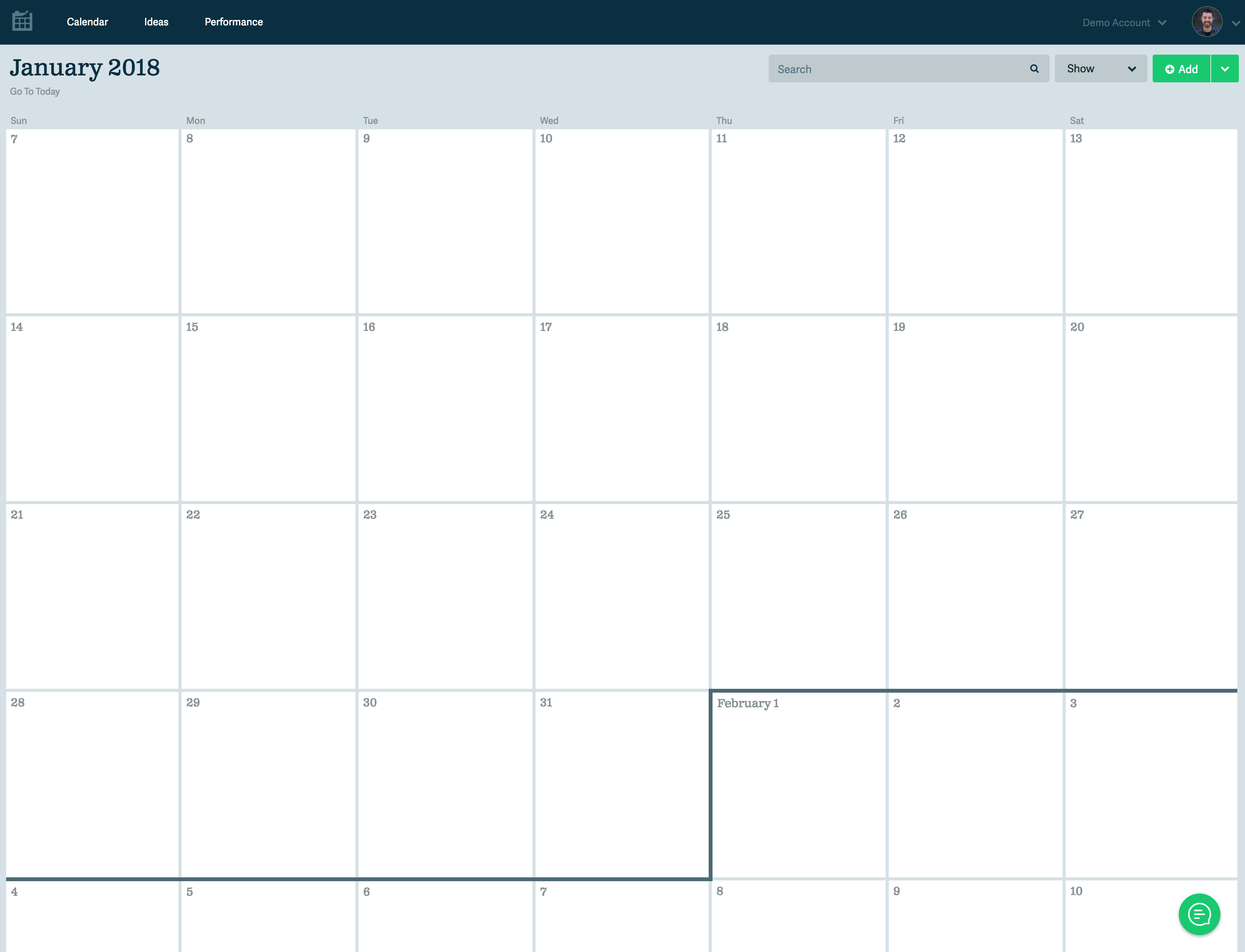
Scrolling calendar view in Ops Calendar
Incremental Improvements
User experience design, especially in software, is all about the small, incremental improvements you make over time. You’ll never get it right out of the gate. And you’ll never be “finished”.
Hopefully these UX tips will help you and your team make those improvements that help users get more done with your tool, faster.
What do you think?